Playtest weekend 06FEB21 & 07FEB21

Hi everyone,

Alpha test weekend - Help us build out our in-station functionality!

banner_playtest

This weekend is our final ‘docked’ in-station playtest (we are back in space, next month!), so please jump in and help us test the new stuff.

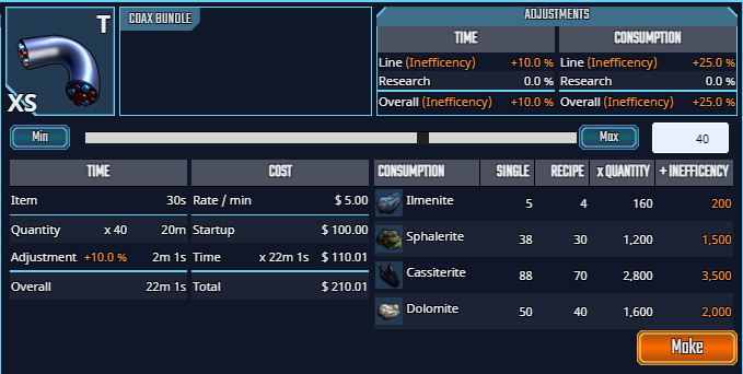
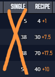
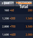
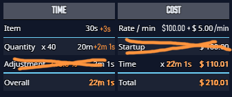
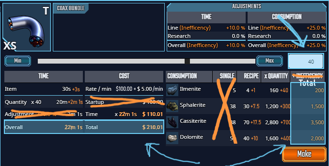
For this playtest, the focus is on some of the deeper areas of the game, such as our item management, ship fitting, player-driven economy and marketplace. We are also testing manufacturing, this time. Please come back here on Saturday for more detail. Information about our last playtest is available here.

We’re running the playtest all weekend to give you time to have a good poke around. You won’t be able to undock and fly around in space during this playtest, but, there will be lots to test, money to spend, things to build, buy and sell… And we really value your feedback, so please join us if you can.

Best wishes,

GM Stormcrow & The AoA Team

1 Like

Hello everyone!

Lots of new things to look at this test - from Manufacturing to a new ship size. Still lots to do, but we’ve addressed many of the items in your feedback so far, and I’ll be replying to each and every one of you throughout today, with progress updates.

Please kick the tires again, and let us know if there’s anything new that we need to address.

Best,

SC & The AoA Team

Patchnotes are here.

1 Like

So I really like it, particularly the new tooltips for the longer named items. One thing that may be in the works that would be very useful, is a search in the market or some way to go from an item I have in the inventory to where I can sell it. For instance, I am not 100% sure which category an Ion Stabilizer is under but I want to sell it.

Also when I am in the market, if the sell button could be greyed if I don’t have anything to sell that would be great.

All in all it seems leaps have been made and I found no glaring issues.!

Loving all the fixes and additions!


Overall I like this interface. However I would like to propose some thoughts to consider:
image

In the material consumption half, I like that I can see the original recipe separate from the inefficiency.
However, I don’t know why I need to see the Single column. Single isn’t really going to give me an accurate idea what I’m spending as it’s going to be subject to rounding once it gets multiplied by pretty much any quantity greater than 1. And if the quantity is 1, then the column on the far right is going to say the same information as the single column so I guess I don’t see it being useful.
image

Additionally, the xQuantity column also means little to me as what I will actually be spending is in the +Inefficiency column. I would propose that Inefficiency be added into the xQuantity column, and the +Inefficiency column be simply a final total.
image

I think the time/cost section could also follow more or less the same style guide. It’s a lot of numbers packed very densely, I think it could stand for some slimming. Similar to the material cost side, inefficiency could be built right into the base values, and the Adjustment and Startup rows could be cut. I also think that, to stay consistent to the other side, the totals should be orange to represent they are influenced by inefficiency.
image

On the topic of data dump, a newcomer is going to look at this screen and see 900 numbers, but at the end of the day there are only three sections that actually determine to whether they’re going to click “make” or not. So I think highlighting them to make them pop or in some way stand out a bit more than they do would be a good idea too:
image

Overall though, pretty freaking great.

1 Like

I’d like to add to PsychoRomeo’s suggestions about crafting window. After removing “Single” column it would be nice to add a column with available materials amount. Otherwise it will be inconvenient to find in the inventory window, especially when these materials are of different types. Also small buttons to quickly go to the market where you can buy some more of them.