Playtest weekend 19DEC20 & 20DEC20

Hi everyone,

We’re excited to have our first playtest that isn’t PvP pew-pew (fun though that is!) and is designed to introduce you to some of the deeper areas of the game, such as the player-driven economy & ship fitting.

Station Funtion Playtest

This test is focused on what we call ‘docked’ functionality rather than in-space combat; which is why we’re running this playtest from Noon UTC (0600 CST) Saturday 19th December to Noon UTC (0600 CST) Monday 21st December; to give you time to have a poke around under the hood. You won’t be able to undock and fly around during this playtest!

This is an essential playtest to make sure that the functionality we’ve built:

a) Passes a general sanity check! (eg Do things do what you expect them to do? Do they work the way you’d expect them to work? Do you find game functions in the places you expected to find them?)
b) Works decently for the widest variety of devices, OS combinations & screen resolutions

We’re specifically asking you to have a look at (and test) the following game components:

  • Inventory Management (moving things from ship cargoholds to your hangar, vs versa)
  • Ship Fitting (swapping modules in your ship fitting slots)
  • Trade (Buying and Selling things from the marketplace)
  • Player Profile (having a look at your player profile, and editing its contents - with markdown, if you like)
  • Ingame Chat (having a chat with other players logged in at the same time)
  • Research Tree navigation (not the full functionality, just the navigation)
  • The User Interface as a whole (how it works for you, resizing/minimising/maximising windows, opening/closing windows etc)

For this playtest, every pilot has been given a ship, a bunch of ship fitting modules and a bunch of cash.

We’d really like you to have a good poke at it, and please take notes for anything that doesn’t make sense to you, or that you feel could cause confusion - and then let us know by replying in this forum thread. We really value any and all feedback - positive or negative - and hopefully we can make the game better!

If you haven’t already created an account, you can sign up here.

With very best wishes, and hoping to see you here this weekend,

SC & the AoA Team

1 Like

Welcome to this weekend’s Station Function Test

This is our first opportunity to let you, our valued founders, alpha testers and playtest participants, have an initial look at the non-combat User Interface (UI), and give us your feedback!

https://portal.ageofascent.com/

Please remember that this is an alpha test, and things are still in development. Not everything is plugged-in and live, and you’ll see buttons, tabs and windows greyed-out or saying ‘Coming Soon’ where dev work is still in progress.

Also, remember that you can use the Ctrl-key with + or - to zoom in or out.

Although there’s lots of items in the marketplace, one of the things you may miss the most is that you can’t sort, search or navigate the marketplace by item category, and this is definitely on the to-do list. The other is that there’s no item/module information popup and so no description of what each item precisely does.

However, there’s lots to test out, and we’d be particularly interested in your feedback on:

a) The overall UI, the design, look and feel - questions such as:
i) Do the icons and buttons make sense and do the things you’d expect them to do?
ii) Are they located in the places you’d expect to find them in?
iii) Within the general UI, is there anything unexpected (good or bad!)
v) What do you think about our new style?

b) General functionality and usability in these categories:
i) Inventory management
ii) Ship fitting
iii) Marketplace (buying from sell orders, and selling to buy orders only)
iv) Research screen (view only)
v) Player profile

If you do get any error messages that don’t make sense to you, please do let us know in this forum thread. At various points throughout the weekend, we’ll be in the chat system and may be able to respond to any questions or comments directly, as well.

Thank you in advance for helping us develop the game, it’s much appreciated!

Best wishes,

The AoA Team

Hi team,
Observations from a quick click around below.

Inventory:
1.Item descriptions are cut off after two lines, show full name on mouseover, no need to truncate when there is nothing in row below it
2.Items should be able to be moved with drag and drop
3.When inventory screen is minimized (to lower right corner), it should maximize from either the bottom right or the side left

Fitting:
enable same drag and drop, and minimize/maximize functions

F_Love

1 Like

After having a look around, I am excited about the release of AoA. The ideas and the framework seem promising, the art is amazing too with a space look like no other, and still has a lot of positive sides to it. Lot’s of the other space-games get a bit dull in the colors. Not here, and it looks good.

Talking about colors, I feel like the color-matching has been thought through and I have nothing to add to that now.
The Roman numbers work well to specify the rarity/tier items.
The fact that you can drag the sub-windows around to your fitting, so you can access the Trade screen as well as looking in your inventory is a nice thought (cough, implement in illy too, cough).
It feels good to click the things around and Cerb mentioned that the drop and drag will be added so I won’t go into that.
Overall, the UI is nicely looking and only needs a few finishing touches that I’m sure is already on the schedule, because you pro. The resistances screen looks good but the fonts are a bit off. Could make that screen a bit bigger somehow or divide it into two - there seems to be some room on the left side where the ship image could be moved over to more, to create more room for the “Combat Attributes” area, which is tied to the resistances. Something like that.
In the research tab it doesn’t feel great to scroll down the whole list. Sections could be made to differentiate things a bit more like in Illy. I don’t mind clicking into the tab that I need to be doing:
Ship Hulls + Ship Equipment
Defense + Utility
Engineering + Mining
Industry
something like that.

Going into the functionality it seems quite smooth, except for the time it takes to open the trade window. There is a delay - but that must be because its loading all the items up. Pretty standard.
Cerb mentioned that you will add some search functions and other goodies to the trade screen. It also needs some more layers somehow, instead of one big bulk screen of tradegoods - although that’s where the search function comes in I can guess at :slight_smile:
Tooltips was also going to be added from hovering the mouse over the item.

So far so good fellas!
Keep up the good work.

EDIT
Hyperlinks, clicky links and all the good stuff. Emojis too. Chat is going to be big here I bet too and we need to be able to express ourselves in all the ways!

1 Like

I imagine a lot of stuff is planned but not yet in, but I’ll bring it up anyway.


Windows 10, Opera:


I wanted to be able to click on people’s names from chat and see their Player Profiles.
image


When mousing over the corner of the Player Profile window, the mouse changes to the “change size of window” icon. This icon stops appearing if you let go of the mouse while hovering over the right side profile pane.
image

  1. Mouse over window corner and observe the mouse change to the resize window icon.
  2. Click and drag the mouse up and to the left to make the window smaller, hitting the minimum size limitation.
  3. Let go of the mouse while the mouse is inside the right side profile pane of the Player Profile window. The window will remain at its minimum size.
  4. Mouse over the window corner again. The mouse no longer changes into the resize window icon.
  5. Click into white space behind the profile window. Repeat step 4 and observe the mouse start changing into the resize window icon again.
    This is purely visual as click+dragging on the corner even without the resize window icon will still allow changes in window size.

On the topic of window sizes, they don’t seem to be saved when closing and reopening a window.


When editing a profile, I expected a discard changes button, with a confirmation. Also a confirmation if attempting to close the window while editing. To cancel editing you have to close the windows or change tabs.
image


While attempting to move a window, if you instead click and drag a tab you’ll grab a link and drag it around.


If you let go of the mouse, the window still stick to your mouse cursor as if you were still dragging it around. Clicking anywhere makes this stop and returns normal functionality.


It’d be great if the local chat had a close button. Get out of my head!
image
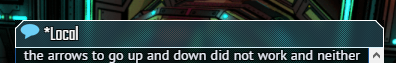
I also expected the asterisk to only appear if the has been a new change (chat message) since the window was last in focus. Bonus points if the change is highlighted for a brief sec upon bringing focus into the window. I also think this can apply to windows other than the chat.

Piggy backing on the topic of chat, KP_Enter doesn’t send chat messages like normal Enter does.


Should chats from me be right justified?
image
I love that chat is justified btw.


If I accidentally click on a tab I didn’t mean to, it opens the window and or brings it into focus. However, if it was an accident, to get it off my screen requires me to go all the way over to its X button on the opposite side of the window. In I would expect to be able to either A) click the same button again to close it or B) just hit escape and close the window currently in focus. Without that I think there needs to be another way to quickly and haphazardly close a window.
image
As a suggestion, Exanima has a similar amount of window management and right clicking anywhere on a window will close it. I really like this as it’s much easier than having to accurately click on the X button. Alternatively, clicking the icon while the window was already in focus could minimize it.

Piggy backing on the previous image: clicking a left side tab to open a window while it’s minimized will do nothing. Expected it to bring the window into focus.

On the topic of focus and minimization, when minimizing a window it folds into the minimized area at the bottom right of the screen. But when restoring it, it just appears open without an animation. I think such animations are extremely beneficial in building a spacial awareness when it comes to parsing the screen. Especially when it becomes cluttered. As an example, when a screen is minimized it goes to the bottom right, but when it is closed it folds into the left side tabs. And vice versa when it’s restored or opened.

On the topic of focus, clicking on the chat window does not bring it into focus. You must click on its header. Expected to be able to click anywhere on this window to bring it into focus, like it does for others.


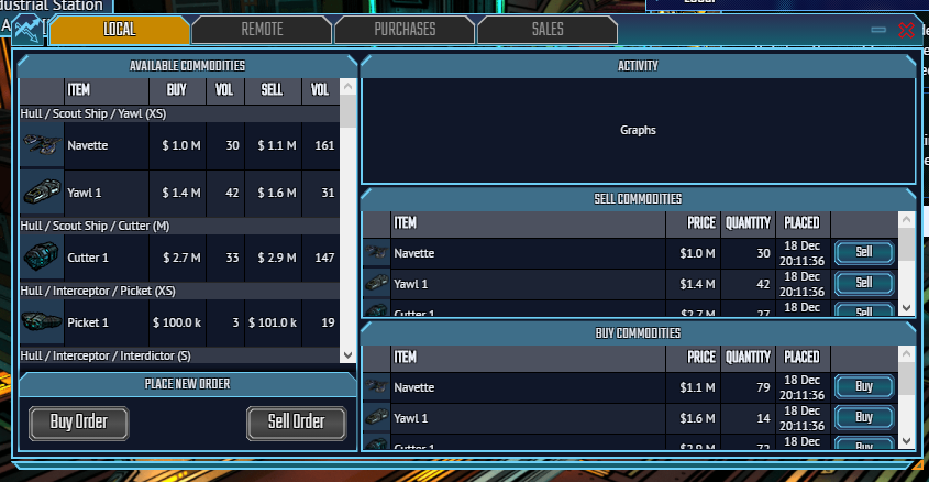
I’m not sure I understand this UI:


In the left pane, the Navette has a Buy volume of 30 and a Sell volume of 161. The right middle pane confirms that I can sell 30 Navettes at this station, but the right lower pane says I can only buy 79 Navettes here. The left pane is labeled Available Commodities so I assumed that I should see at least 161 Navettes available for purchase. Otherwise it wouldn’t be ‘available’, right?

Assuming I’m understanding this UI correctly (which I quite honestly doubt), the user interacts with the Trade Orders that are currently listed at the station. Kind of like a marketplace board, with each trade order having its own prices, rather than a more traditional general store style shop. The station actually has 161 Navetes in its cargo hold, of which only 79 are listed under a sell order. I’m not sure why I should see the station’s inventory at all, given that this is a trade window and my primary interactions are not with its cargo hold, but with its trade orders. I’m not totally sure a station owner would want to advertise its cargo hold either.

I think this UI has a lot of redundant information. Were I to dock to a station and open a Trade interface, I would expect to see the open trade orders and see buy/sell buttons next to them. I am not sure what purpose the right middle and right lower panes actually serve.

It’d be great if the interface had some more recognition of my own assets. I don’t know why I could click the sell button next to an item I had nothing to sell of. I don’t even know how much I have of what I have and I don’t love the idea of having to open my cargo hold to check, as this requires a lot of real estate.

Comparatively speaking, this window takes a long time to load. I assume because of the pictures. I imagine it doesn’t help that the pictures are loaded in three times.

I would also love to see some filters similar to the fitting window.


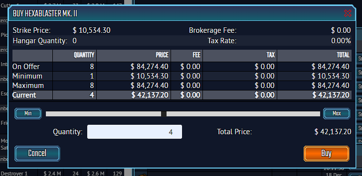
I don’t quite jive with this UI either.


Why does the “Minimum” row exist? Will it be common that it’s mandatory that I buy x number of a thing at a time? If not super common, I would have expected to see a “Minimum purchase quantity = 4” disclaimer somewhere, or something along those lines. Similar deal with the Maximum row. Will this ever be unique from the On Offer row?

All the information of the Current row, I would have expected to be itemized over next to Total Price in the bottom right above the Buy button. Kinda like a receipt.

I would have also expected to see “Remaining Funds” itemized, so I don’t have to do 1.2m - 42k = ?? in my head. Alternatively this could also be in a confirmation window.

Also I think there should be a purchase confirmation window. I know I will end up accidentally buying things especially on mobile.

I do not appreciate that the default quantity is half. I don’t know that I’ll ever be seeking to buy exactly half of something. What the default value should be is kinda a difficult question. In my experience, the best default value I’ve come to use was in Dofus, where the default was the maximum and highlighted, so if you didn’t want to purchase/sell/move the maximum you could just hit [number] [enter]. Very quick.


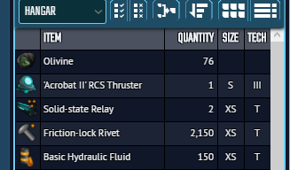
Think it’d be great to have tooltips for the inventory buttons.
image
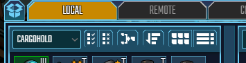
Additionally I hope to see more sort options, such as by type, size, value, etc.


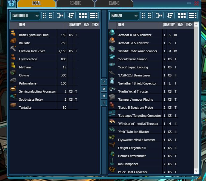
I did not always appreciate the automatic resizing of the cargo hold window when moving stuff around. Here, I tried to move everything from my hangar to my cargo hold and it made the window run off screen.


I don’t think these need to be two separate buttons, but instead a cycle or toggle.
image
Additionally, my settings weren’t saved when switching between tabs or closing the window.


I think the list view needs to maintain some aspect of its color coding. Maybe just a colored bar to the right of the icon or something. In both the inventory and the fitting windows.
image


These buttons need a pass I think:
image

The Move Left All button needs to have a confirmation lest I fat finger it and nuke my loadout.

The Move Right All button seemed to be somewhat random in its function, I was not able to dial in a pattern but it would usually only fill either the green slots or the last green slot. I think it would work as an ‘auto best’ function for the lazy.

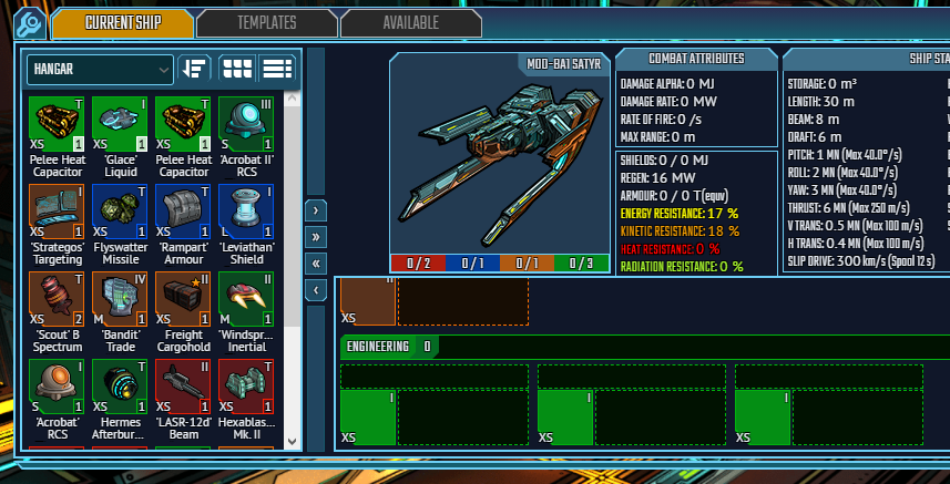
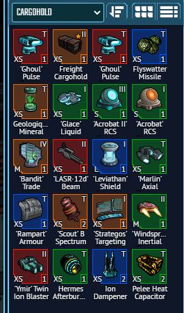
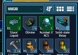
I also noticed that the Move Right button wasn’t super reliable. In the below image, I have three modules selected and three slots selected. I believe I have the size, the color, and tech properly respected. When clicking Move Right, I would have expected all three to move, but none do. If I unselect Glace Liquid and click Move Right, it moves the other two as expected. I actually think this has something to do with a problem in the third engineering slot, which seems to really only accept Hermes Afterburner and reject everything else.

Piggybacking on the above image, if something cannot be equipped in this ship, I think it should grey out and appear at the bottom of the list. In the above image, Acrobat RCS among the modules not equippable.

Also piggybacking on the above image, the highlighting that shows whether something is selected or not could use a bit more contrast I think.


Switching between icon view and list view, or between hangar and cargo hold will make non-equippable items appear in the Fittings window. Equipping something will correct the this.
image
With that said, I’d love to just shoot barrels of methane or handfuls of rivets at people.


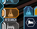
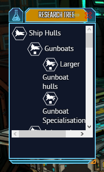
In the Research window, if there is a horizontal scroll bar, I don’t think there’s a need to wrap text.
image


Also, I love the vibrancy of the color scheme. It really gives it an epic comic book like feel. And the UI style fits this perfectly, in my opinion.

It was really fun poking around and seeing what’s up. I hope to see more of these in the near future!

Wow its so nice to finally see the hanger and some of the other elements of the game. I really like the color scheme and design for the hanger though it would be nice if we could pan the camera around our ship so that you can see it from all angles. I noticed a couple of things with the Inventory.


This just seems to be a bug where the tables pull out of alignment with when using the filter to sort items by name. Also I feel that the arrows in the middle to move items could be changed to provide a little more utility and function. The single arrow should move quantity 1 of the selected item over, while the double arrow should move the entire quantity of the selected item. If I want to move all of the items out of my inventory, I can just use the select all button and move everything over with the double arrow button. Having the double arrow move all items over seems repetitive when there is a select all button at the top. The item splitter is nice when dealing with large quantity items but being able to move a single item at a time is nice when dealing with small quantities.
aoa3
I feel these items should be organized by module type first and then alphabetically. Being able to sort by tech class and size would be nice too. Perhaps one button at the top that when clicked would scroll through each one of these options. Seeing a full item description when hovering over an item would be very helpful.

Haven’t had the chance to try out too much trading but as others have said search/filter will be necessary.

I like the research tree but having the items collapse and expand with their subcategories would be nice.

General things:

  • When taking modules off a ship, the game will change cargohold to hanger, but item will still be placed back into the cargohold. This also happens when placing modules into the ship.

I guess that’s it for now, I love seeing all the progress that has been made.

Chat now is a bit improved; but more important has a history, rather than just showing up blank when you go in.

It also says Player has docked at 6:45 rather than randomly saying Hello on your behalf

1 Like

Hi F_Love!

Fixed (at least, full name on mouseover, still looking at truncation when row below is empty)

Totally agreed. Not there yet, but will be.

Done!

Many thanks for your feedback, and helping us to make a better game!

SC

Hey Josh,

Heh, we don’t want to look after 2 UIs… so yes, anything and everything that’s here in AoA (in terms of UI and usability) will ultimately come to Illy as well (huzzah!)

Fixed!

Still working on the research screen, but yes - totally agreed.

Should be much faster now; albeit bear in mind that we’re working from the dev server rather than production atm.

Yeah, trade still needs search and filters (ie, only show me prices for goods I have to sell; wish/watch lists etc). However, the new drop-down catgorisation helps a lot.

Done!

Hyperlinks are in, emojis to follow!

Thanks for your feedback, much appeciated!

Best,

SC

Yep, coming soon (with other interaction options such as private chat, igm, etc)

Nope, but they should be - something we’re definitely going to do though.

Should be fixed! Let us know if not :slight_smile:

Yep, agreed entirely - will be added.

Fixed

Agreed, and on our to-do list

On the focus stuff, all agreed and on the to-do list!

Re: Marketplace, I think it’s clearer now?

Yep, 100% agreed. Not there, but on the to-do list.

Fixed, set to max.

Fixed, I hope!

Agreed - on the to-do list!

Yep, agreed. On the to-do list.

We’ve removed the double (move all) buttons

Now greyed out, but still need to move to bottom of the list.

Fixed!

tyvm for the feedback, much appreciated!

SC

Should be fixed now!

Move all arrow is now gone; select all->move is the right way forward, tyvm!

Yep, agreed! On the to-do list.

Pretty sure that’s now fixed, but do please test and let us know!

SC